Bike Share Usage
Bike Share
Ten years ago it was rare to see a bike share program in any city. Today, it seems like every city you visit has a program. How do these programs grow across a country, as well as within a city? To be successful they must expand strategically into areas where they will see high use. Fortunately, there is a lot of data shared from existing programs as well as organizations like the U.S. Census Bureau . Bike share programs can leverage these extensive datasets to choose where and when to invest. As an example, Chicago’s bike share program, Divvy , collects ~2,000,000 data points per year. Can we use this and other related datasets to reveal where investment will be most beneficial?
Stations, Awareness, or Routes?
Let us start with the data. We have bike use data by the station of where and when the rental occurred and where and when the bike was returned. We combine this data with census data and the Google Map API to figure out where people are biking, what areas they live in, and what routes are frequented. From this information, we can reveal which regions of Chicago are under- or over-serviced by bike share stations.
| Data | Description |
|---|---|
| Station Use | Time and Where Rented and Returned |
| Bike Commuters | Percent by ZIP code |
| Routes | Most likely routes between stations |
Model
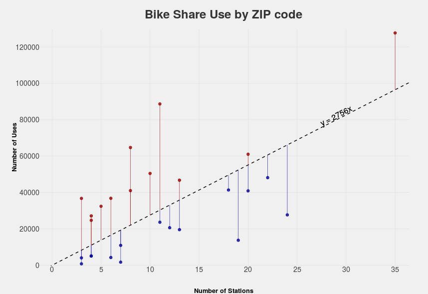
Simplicity is important when constructing models, think Occam’s razor. One of the most fundamental tools in any statistician’s toolbox is a linear regression. Conceptually, a linear regression draws a line of best fit through the data. This supervised learning technique reveals how each input variable relates to the response variable. In our case, it will reveal the relationship between % bike commuters and station use. Any deviation above this line would indicate over-performance and below under-performance.
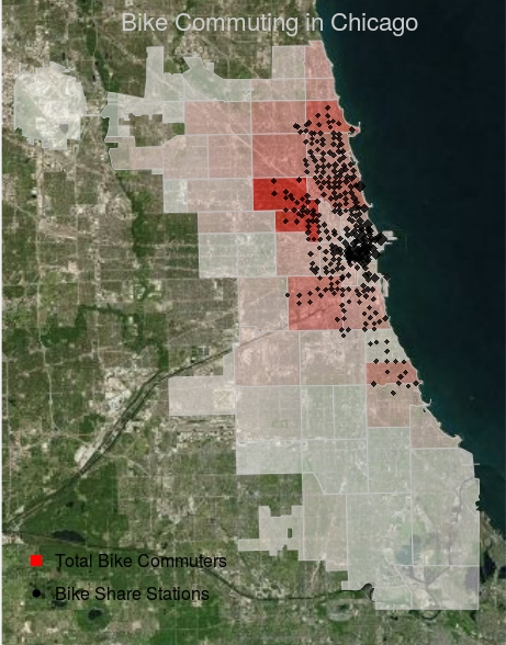
In our example, the combination of local bike share information the Census’ American Community Survey reveals that the northwest side of the city has the most bike commuters, and this is where many of the bike share stations are located. However, the correlation is not perfect. Many regions with high numbers of commuters are under-represented by stations, with few active bike routes. The lack of active routes through these regions suggests the need to invest in bike lanes to promote travel. A regression on use data aggregated to the ZIP code level reveals which areas have over-utilized and which have under-utilized stations. Areas with few over-utilized stations suggest a need for more investment in stations. This simple analysis provides valuable insight into how and where share program investment should take place. Bike share programs can leverage their extensive datasets to inform both bike share investment and promote governmental investment in proper infrastructure.
Where are the Bikers?
Anticipating Station Use
Where to Invest
-
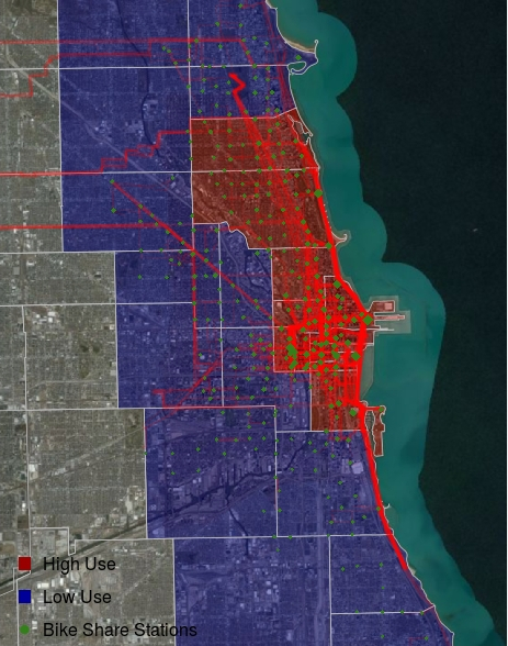
Station Infrastructure: Most of the over performing bike share stations are located in the city center (Red). Station investment should take place in these zip codes.
-
Bike Commuting Awareness: Underperforming performing bike share stations are located peripheral to the city center (Blue). Programs need to be implemented to promote greater use before stations are invested in.
-
Bike Lanes: Dark red lines reveal the most common biking routes where commuting infrastructure should be focused. (Google Map API)