IMDB Ratings PT. III
We have established that the Simpson’s IMDB ratings are declining and that the average IMDB rating is higher than the expected 5.5. Lets transform the data so we can examine the ratings on an interpretable scale.
First lets plot the ratings of the Simpsons episodes on top of the ratings of every TV show since 1985. Now we have context. Here we can see episode ratings drop below the median line in the late 90s, and continue to drop further with each year.
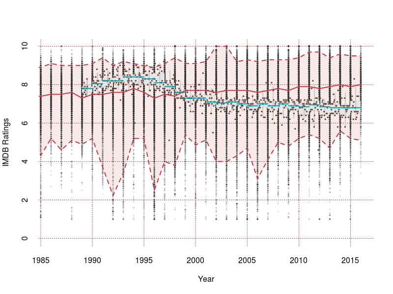
Great, the decline is obvious, and and we are now using the IMDB data as a reference point. We can do better.
Lets make some assumptions and rescale the data to make it interpretable.
Assumptions:
- Rating data can be aproximated with a normal distribution truncated between the lowest rating 1 and highest rating 10.
- Each episode should evaluated in reference to shows of the same year. This removes trends in rating bias, but may unfairly consider each year to be of similar quality.
Method:
- Calculate the mean, $\mu$, and variance, $\sigma^2$, of ratings for each year.
- Use the mean and variance in a truncated normal distribution to determine what percentile each rating falls in. Where the 99 percentile is exceptional, 50 is average, and 1 is abysmal.
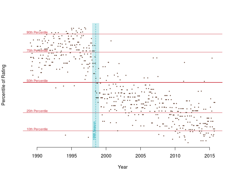
Now we have an accurate picture of how good the Simpsons have been through time. In the early 90s they were almost always better than half of all shows on air. More typically they were better than 75% of all shows. Since the 1998 season quality has declined, and episodes were quickly worse than most shows on air. Since 2010 the outlook is even worse. Now its not uncommon for episodes to be worse than 90% of other television, and are typically worse than 75% of all television.
From better than 75% of all shows to worse than 75% of all shows
In the next post we will expand this analysis, and build a tool to allow the comparison of any program or movie to a baseline of your choosing.